

A sunrise shoot and a tricky question
A sunrise shoot and a tricky question
Why do we like some images over others?

Hello, I’m Gill and I write a photography blog inspired by the landscapes of Suffolk and beyond. Please subscribe to read more of my writing and visit my website to view my images.
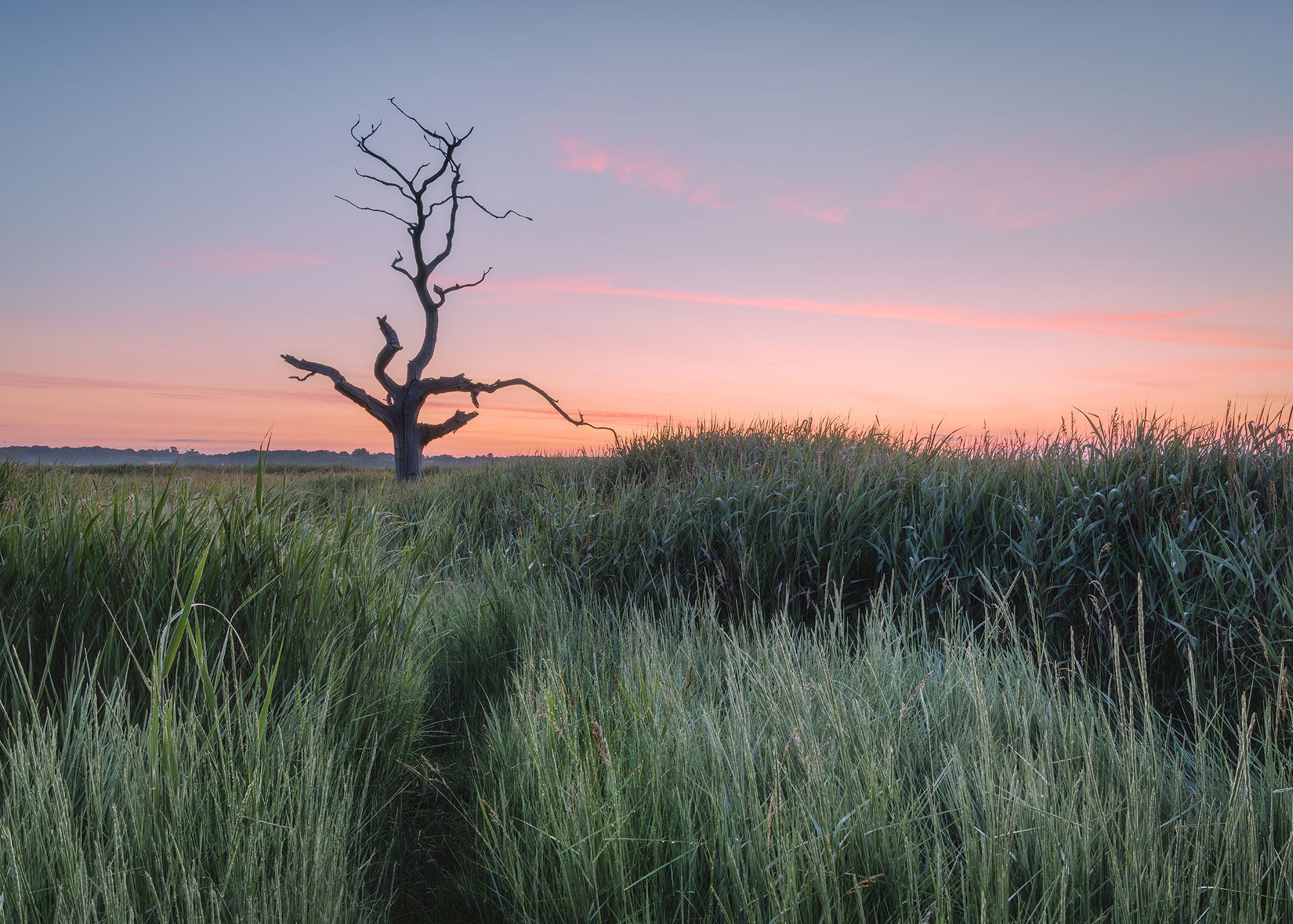
The morning was perfectly still as I made my way towards the edge of the marsh. A vale of mist hung over the distant river and the dawn light glowed pink on the horizon. Beside me the sound of a cuckoo rang out across the reeds, its song answered, as if in an echo, from the opposite bank. It was 4.15am and I had been up for an hour. This was as close as I was going to get to a summer solstice sunrise. The longest day was still two days away and would be one minute longer in daylight time but I didn’t mind, I was here to experience the new dawn and all its beauty.
I had come to an area of marshland to photograph an old dead tree that I have shot only once before. I scouted the area a few weeks ago and the tree was easy to access. But in summer everything grows quickly and the reeds were now as tall as me and the tree was much harder to reach.
As I pushed my way through the overgrown path dew cascaded from the vegetation, soaking my clothing. Despite the unintended shower, progress was easy and I quickly reached a small opening and set up my camera for a shot.
The conditions were some of my favourite to photograph in. There was no wind, it was perfectly still, the sunrise colours were lovely and the dew sparkled in the reflected light. I could feel the excitement rising within me.
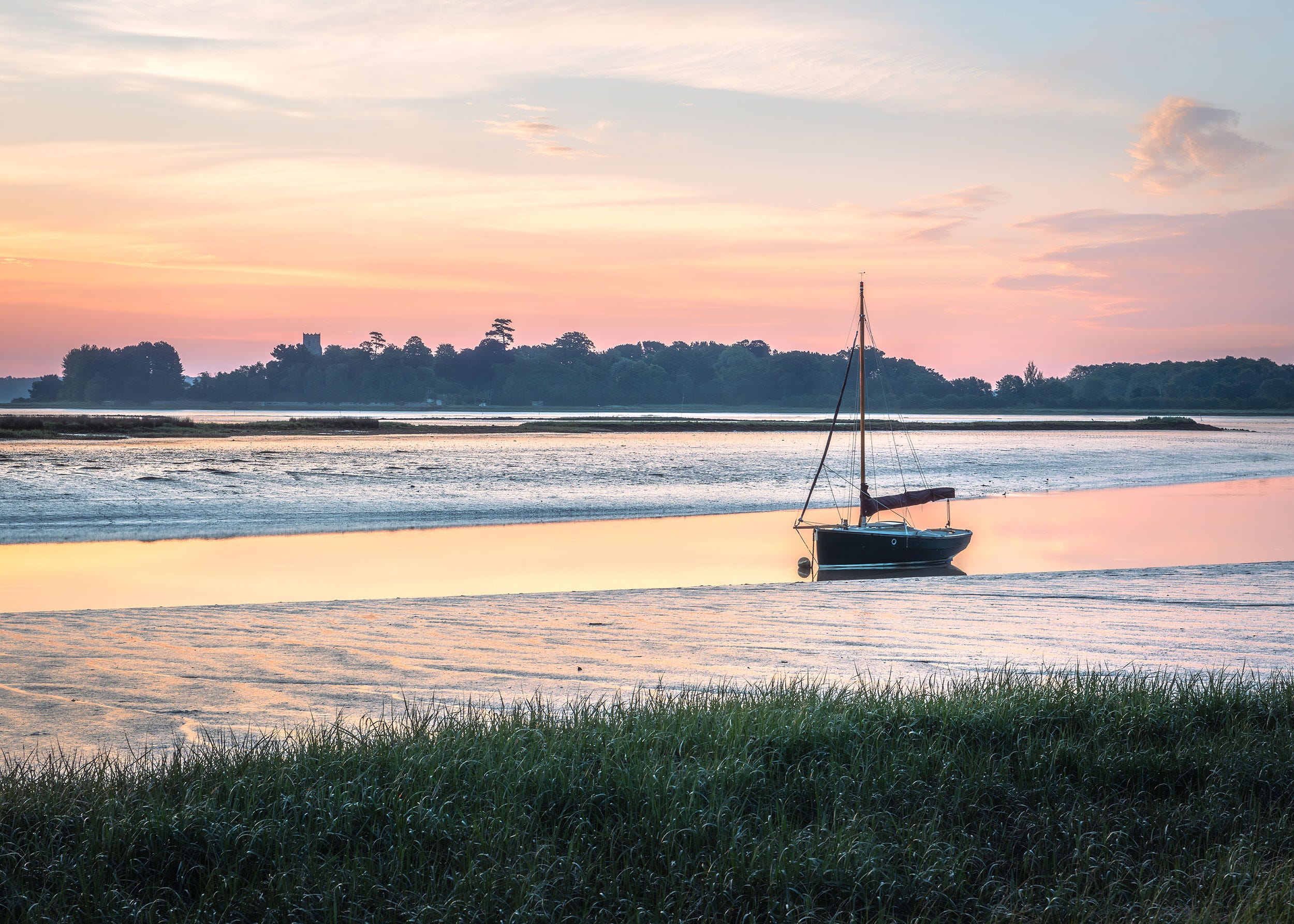
I took several images in this location with a mix of compositions before moving further down the river to watch the sun rise across the water. By the time I had finished I felt satisfied that I had some good images that I could work with.
Back at home I processed what I considered to be the best images from the morning but despite the conditions being perfect I wasn’t really happy with how my tree image had turned out.
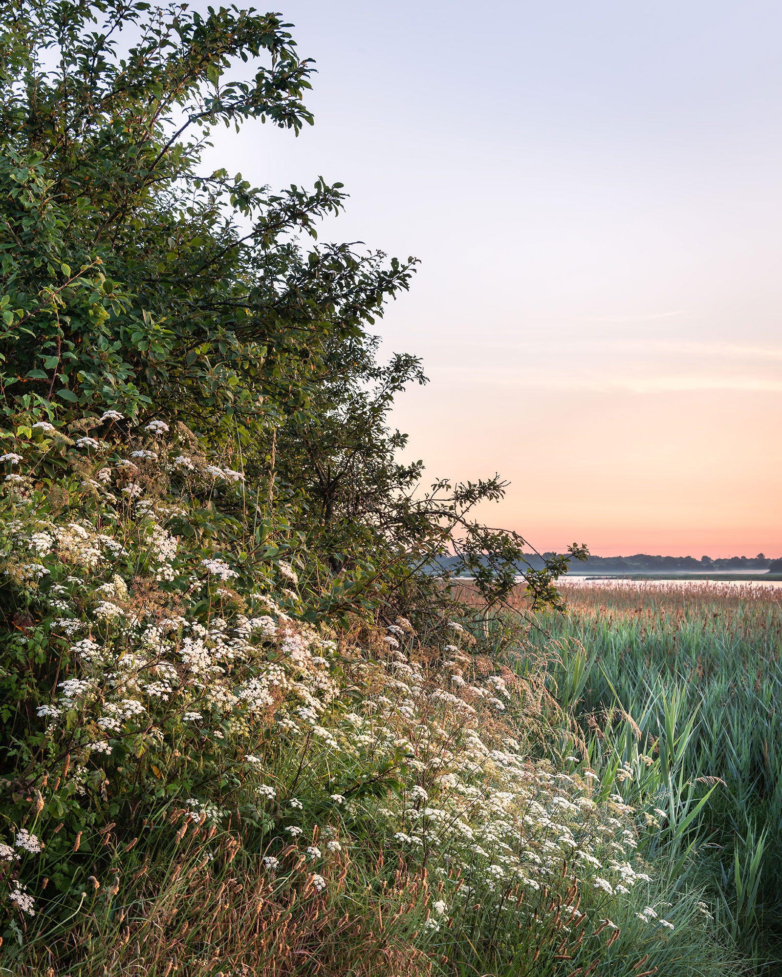
The other images I chose included a composition of the river and a quick shot of the hedgerow taken from the edge of the path. This turned out to be my favourite image of the morning. However when I showed my partner the shots, he preferred the tree image to the other two. This got me thinking.
How do we read an image and why do we prefer some images over others?
What we like in art and photography is all subjective - there are no right and wrong opinions but I do think there are some fundamentals about how we read an image that may help us understand why we like some things over others.
When we look at an image we decide almost immediately whether we like it or not, based upon how our brain deciphers the information it receives from our eyes. However it doesn’t process all of this information equally, instead it is hard wired to search out particular features. This job is done by the visual cortex which analyses images based on hue, dynamics and realism.
A more detailed analysis would be:
Hue - colour, contrast and brightness
Dynamics - composition, size, motion and flow throughout the frame
Realism - visual intrigue - ie something you haven’t seen before, a unique angle or an unusual method of processing or representing the scene.
Our brains will break down an image into these essential qualities and will then decide whether they are pleasing to us or not based on our own personal aesthetic taste.
So going back to my images why didn’t I like the tree shot as much as the hedgerow image?
I took two versions of the tree image - one as a landscape shot and one as a vertical image and you can see that the light was changing fast as the sun got closer to rising.
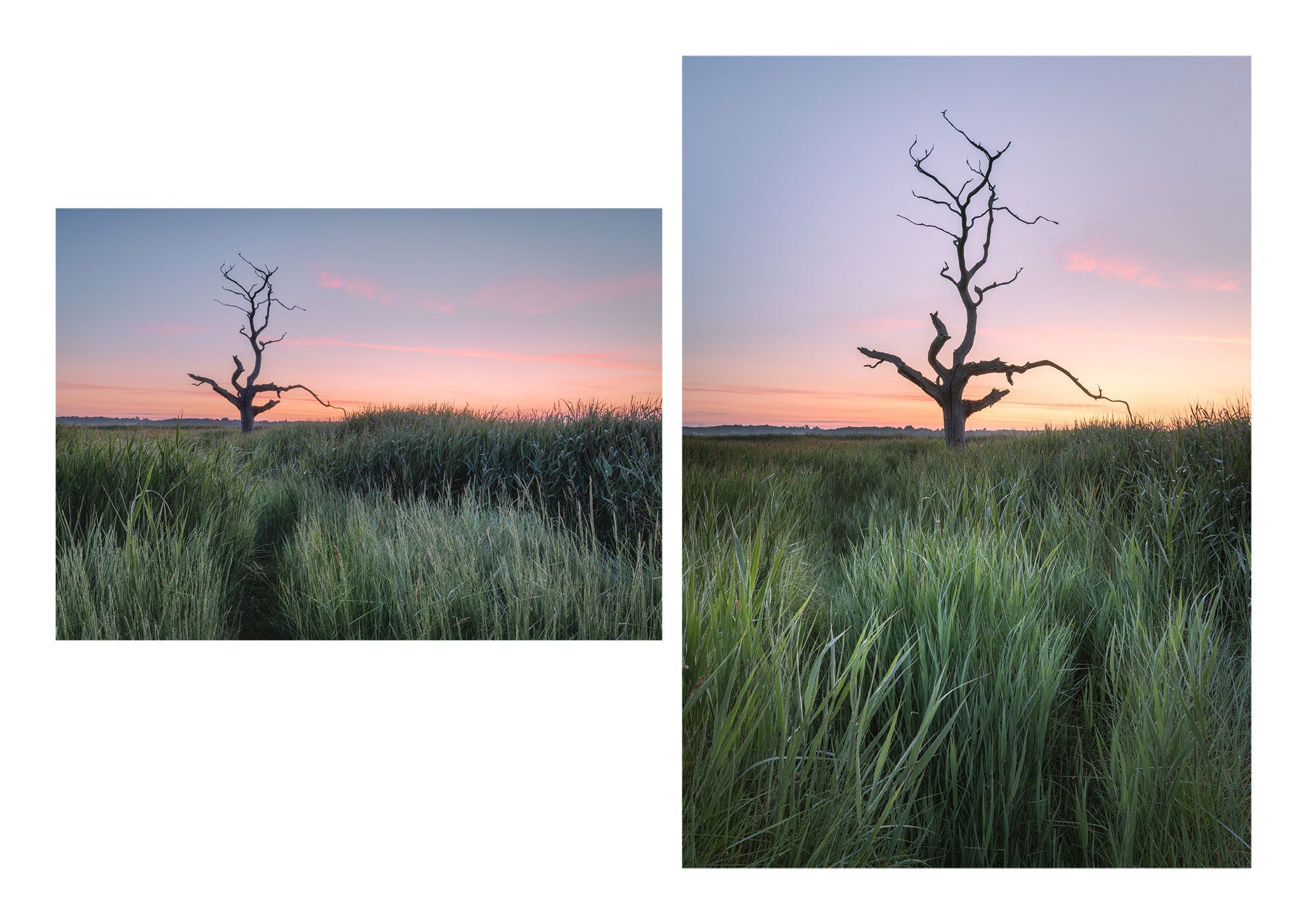
I think the images work reasonably well from a compositional point of view; the dark tree stands out well from the bright sky, there is a visual flow using the paths through the reeds and the contrast between the brighter areas and the shadows. But I think the thing that doesn’t appeal is the colour combinations. There is something about the green / blue / pink and red dynamic that I personally don’t like. So now when I look at these images I can’t get beyond that issue and my eyes don’t really see all the other details that I actually really like.
My second image was a shot of the river. Whilst I do like this shot, it is one I have taken many times before and so for me it is not unique or very creative. It does give a good representation of the morning and I do like the colour combinations. There is some nice light running through the frame and the composition is very simple and easy on the eye.
My third shot is my favourite, probably because it features all the elements I like and it isn’t something I have taken before - so to me it has some visual intrigue. I love the soft light, the near and far composition, the subject matter, the fact that it features no man made elements and that it conveys to me the beauty of a summer sunrise on the river. In terms of aesthetics it is the colour combinations, the textures and the luminosity of the dawn light that I find attractive. And if we look at the elements our brain uses to process an image this shot has:
Colour, contrast and brightness which to me are all visually appealing
Composition which features size (prominent foreground), motion and flow throughout the frame (using the foreground / background relationship as well as the diagonal line created by the hedgerow from top left to bottom right).
Visual Intrigue - at least to me. This shot represents a view I haven’t explored before where as the other two shots are compositions I have already taken. Maybe this small detail alone explains why I prefer this shot?
I don’t think there will ever be a recipe for the perfect image, and if there was the world of art and photography would be a dull place. However I found it interesting to understand a little more about how my brain reads images and what factors might be important in creating a universally appealing shot.
Analysing my images and working out what I liked and what I didn’t was also a really valuable exercise that I would recommend to anyone wanting to progress their photographic journey.
My thoughts and feelings about my own images will be personal to me based upon my aesthetic taste and how my brain interprets what it is seeing. We will all have different views and that is the beauty of art - we all have a unique perspective and will all like different things.
Which image did you prefer and why? Do you analyse your own work and does it help you grow as a photographer. I would be really interested to hear your thoughts so please feel free to comment below
If you are interested in reading more about composition then please download my free PDF on the subject.
Thank you very much for reading and until next week enjoy your photography.
Gill
Gill, I think playing with composition is such an interesting process. I often re-work older images just to try things. I like the Hedgerow image - it has a very strong geometry to the composition. I am a sucker for that diagonal through the image, plus each half is split in half (sky and reeds, flowers and hedge). I also like the tree photo - did you try the landscape version as a square crop - the reeds would then have four roughly equal sections with a centred tree. That could be interesting, although that wouldn't solve your colour problem (could you tweak the green of the reeds?)
I like the horizontal photograph of the tree. Mainly because I love dead trees, but also because they seems to be a path to the tree (which isn’t really obvious in the vertical version). To me it adds to the story and this way makes it more interesting. But I also like the photo of the hedgerow, because it is different and not your typical landscape photo.
And kudos to you for getting up so early. I am glad it was worth it! 😆